Top 5 Graphic Design Trends to Watch in 2023
Get news & insights direct to your inbox.
The start of a new year is the perfect time to reflect on your organization’s existing branding or website. Nothing says “renewal” like a refreshed brand palette or enhanced web design. As we transition into 2023, our team decided to take a deep dive into the current and upcoming graphic design trends in marketing and website design.
Design trends and consumer preferences of style are shaped by changes in popular culture, with the internet being the most significant force and influence on the industry. Be it packaging design or social media post templates, consumers are taking a closer look at the effort a brand puts towards creating an “aesthetic.” Branding is no longer a logo and color scheme but an experience. Taking a more thoughtful approach to the graphic designs applied to your branding is essential to winning over consumers in our digital age. That includes the occasional re-branding and refresh to demonstrate that your organization is up to date.
In 2023, we find that design is “pushing the boundary” and rebelling against the clean and simple minimalist design trends of the past few years. Here are the top 5 graphic design trends to watch for your business and social media in 2023:
- Expressive Typography
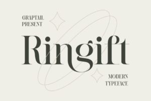
Image Via Dafont Free
More than the message words deliver, the font and typography that dresses our language are evolving. Designers are applying playfulness to their typography styles. Serif fonts are making a powerful return to modern design with a retro twist. Designers are pushing the envelope of contemporary typography and creating custom fonts and typographic illustrations to serve as the focal point of advertisements.
As popular culture becomes more diverse, it is natural that advertising and typography will evolve to complement the individuals producing and consuming that content.
- Inclusive Visuals
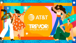
Image Via ATT
Graphic designers and visual artists are fully embracing the advancement of diversity and applying it to their designs. Not only are we seeing equity across race, sexual orientation, and culture, but we are also observing more widespread inclusion of disability, accessibility, and gender within the illustrations and photography used in branding and advertisements.
As organizations across all industries work towards fulfilling diversity, equity, and inclusivity initiatives, they are also applying more diverse and inclusive stock photography, art, and messaging into their websites, social media, and advertising campaigns. In 2023, diversifying the visuals associated with your organization will continue to grow in importance and necessity when building and promoting a positive brand image.
- Minimalist Vintage/Retro/Y2K
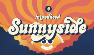
Image Via Behance
Nostalgia is becoming a massive part of pop culture and modern design trends as the “90s” kids advance in the workforce. Retro vibes, vintage art, and Y2K-inspired designs and color schemes are becoming common as ads are being created to resonate with younger audiences. Vintage designs evoke fond memories of a simpler time when artists made things by hand with attention to fine detail. In addition to the ethos attached to this trend, it is widely believed that artists of the past put more “soul” into their work, making it more valuable and memorable.
- Brutalism and Utilitarian Design – The Rise of Anti-Branding
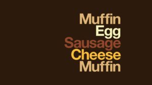
Image via DeZeen – McDonalds
Brutalism is a design style characterized by raw edges and a wireframe-like feel. It can send a powerful message when used correctly. In the same way vintage and retro design trends speak to consumers’ emotions, brutalism gives designs a touch of reality and a more “human-like” feel. For many, seeing an unfinished piece is more relatable than a polished product. Similarly, utilitarian design follows the principle that the object or work should be based mainly on its function and purpose rather than aesthetics. Designers are combining utilitarian and brutalism design theory to form an “anti-branding” experience for users that removes any confusion or unnecessary elements.
In the digital-driven design landscape, very little is left “unfinished.” In fact, there is an overcomplication of systems, visuals, and directions that can prevent desired user behaviors. This straightforward approach to design is striking and can stand out in a crowded marketplace.
- Surrealist Maximalism
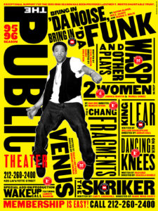
Image via MadameArchitect
In an act of rebellion against modern, simplistic, and clean design trends, Surrealist Maximalism is a feast for the eyes. Surrealism is bold, artistic, and colorful and would not make complete sense if transferred into the physical world. Surrealism draws people into an almost alternate reality with its uniqueness. Moreover, maximalism styles are defined as excess – more is more.
The marriage of these two styles produces an intense, colorful, highly-saturated visual that is memorable and can convey many different messages at once. As AI art ventures into new territories, surrealist Maximalism reflects the clash of the creativity of humanity and technology. Brands that may have leaned towards a clean and straightforward aesthetic may consider adding a bit of excess to compete with more compelling visuals in the marketplace.
Subscribe to our newsletter and follow us on LinkedIn for the latest news and marketing insights that can impact your business.
